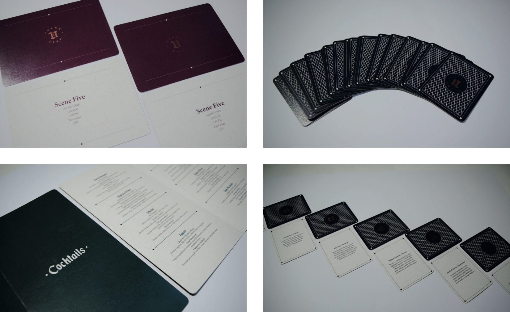
Character cards
These are my versions for the design of the character cards. I decided to make them landscape and a relatively simple design on the back to be similar to the rest of the branding. I did not feel something overly decorative would be appropriate as the brand is mostly clean, simple design. We did not end up using any of these designs as a group in the end and we opted for something very decorative in the end.
These are my versions for the design of the character cards. I decided to make them landscape and a relatively simple design on the back to be similar to the rest of the branding. I did not feel something overly decorative would be appropriate as the brand is mostly clean, simple design. We did not end up using any of these designs as a group in the end and we opted for something very decorative in the end.
Posters
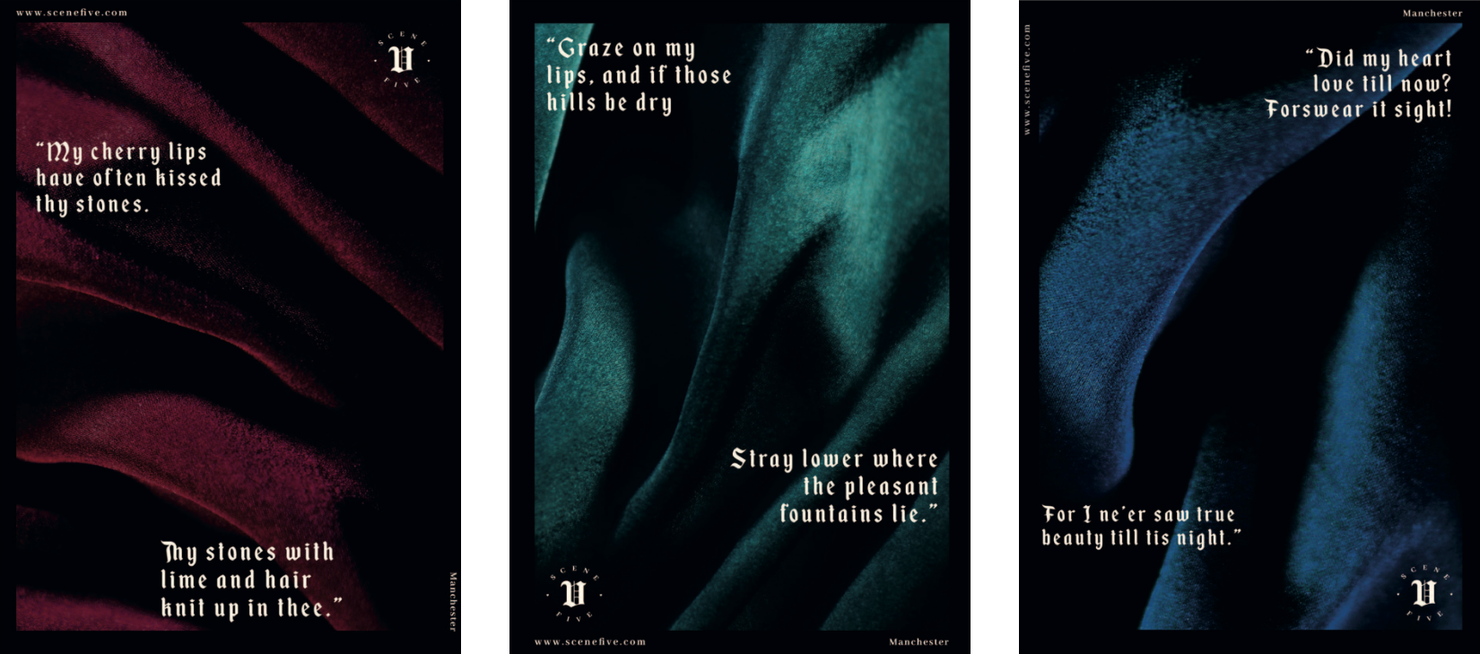
We opted to advertise through posters as opposed to do more modern advertising methods such as social media, tv adverts etc this was for a few reasons, mostly because we wanted the event to have an air of mystery about it and to be quite a secretive thing so only the few that find these posters can come. Secondly we thought it would be on brand for us only to use printed materials due to us trying to emulate an ‘old world’ style event and the people of that time period would obviously not have access to digital materials.
We opted to advertise through posters as opposed to do more modern advertising methods such as social media, tv adverts etc this was for a few reasons, mostly because we wanted the event to have an air of mystery about it and to be quite a secretive thing so only the few that find these posters can come. Secondly we thought it would be on brand for us only to use printed materials due to us trying to emulate an ‘old world’ style event and the people of that time period would obviously not have access to digital materials.
Playing cards
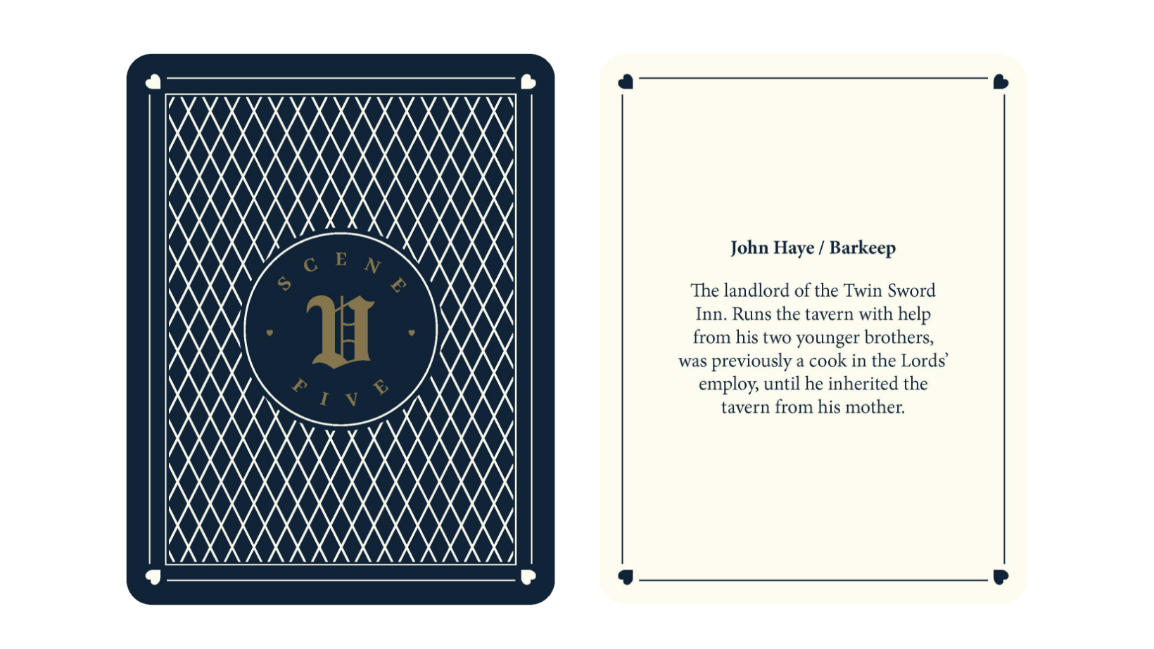
This is the final front and back designs of the character cards, you would have a character assigned to you for the event on which you will get an outline of the person you will be roleplaying on the night. I thought it best to go with a more decorative back design to give them a more luxurious, decedent finish as this is an exclusive event. To add to this, they are hand finished by stamping the logo on with Bronze ink.
This is the final front and back designs of the character cards, you would have a character assigned to you for the event on which you will get an outline of the person you will be roleplaying on the night. I thought it best to go with a more decorative back design to give them a more luxurious, decedent finish as this is an exclusive event. To add to this, they are hand finished by stamping the logo on with Bronze ink.
Cocktail Menu
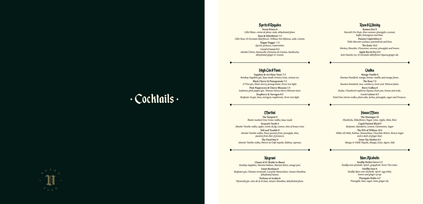
This was printed and hand finished in the same way as the cards and invites to keep a consistent quality across all the printed materials. The cocktails names where also carefully chosen to support our Shakespeare theme as each name is inspired by memorial moments form his works.
This was printed and hand finished in the same way as the cards and invites to keep a consistent quality across all the printed materials. The cocktails names where also carefully chosen to support our Shakespeare theme as each name is inspired by memorial moments form his works.